

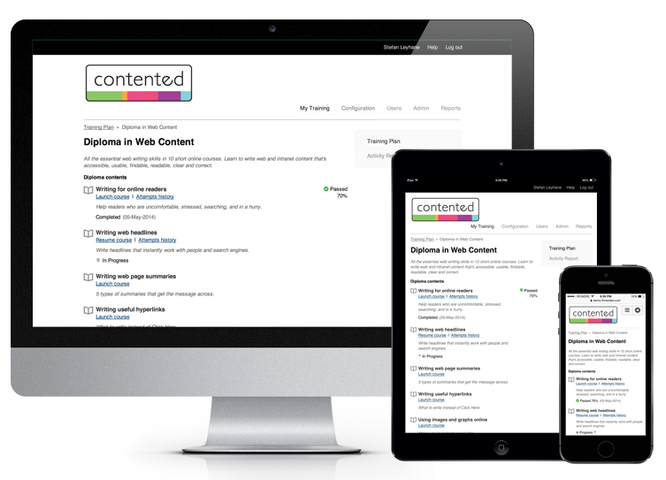
The experience using Firmwater LMS on phones and tablets is now improved.
While our LMS always worked on these devices, it used to require a lot of pinch and zooming. The interface now adapts to the screen size that you are using, using a technique called Responsive Design. Those blessed with ‘Retina’ devices, now get the benefit of new, sharper icons too.
Our first goal is to optimize all the student-facing pages and we’re almost all the way there. We will finish off the few remaining pages and then start to tackle the administrative pages. This will be a longer term effort as converting some of the administrative pages present a larger challenge.
Your content needs to support these devices too
Of course, for your students to have a full mobile or tablet experience, your course-ware needs to be able to run on these devices too. Most of the popular third-party authoring tools (Articulate, Captivate, Lectora, iSpring) can now output to HTML5 (Flash doesn’t run on phones and tablets). They seem to be all battling to win your heart in this regard.
The key, however, is to test, test, test your content on different devices. While the state of the art is improving, we’ve found that the performance doesn’t always meet what is advertised. Some interactions work well in HTML5 and others don’t. Your success will be determined by the tool you’re using and the nature of your content.
Please get in touch if you’d like more insight. We hope you enjoy these improvements.

Firmwater Updates: Summer Round Up 2025
2025 has been an exciting year for Firmwater, marked by several new product updates and enhancements to existing features. As always, every new feature and...Continue reading→

Unlock Recurring Revenue: Sell Course Subscriptions Through Shopify
Firmwater is pleased to announce we now support subscription selling as part of our Shopify eCommerce integration. We’ve partnered with Seal Subscriptions, a Shopify subscriptions...Continue reading→